
Ryan RosenblattJun 5, 2025, 09:47 AM ET
Every January and February, MLS teams drop dozens of new kits for the year and then shortly after we get new NWSL threads. Some of them are great, others not so much, but American soccer kit culture runs so much deeper than just the top divisions.
In fact, it's further down the ladder where you will find a lot of the country's more interesting kits. Unencumbered by league-wide kit manufacturer deals and restrictive rules, with the freedom to really home in on what makes the club unique, the USL Championship, USL Super League, USL League One, MLS Next Pro and NPSL give us most of American soccer's boldest designs -- for better, worse and, well, eye-catching.
Best kits
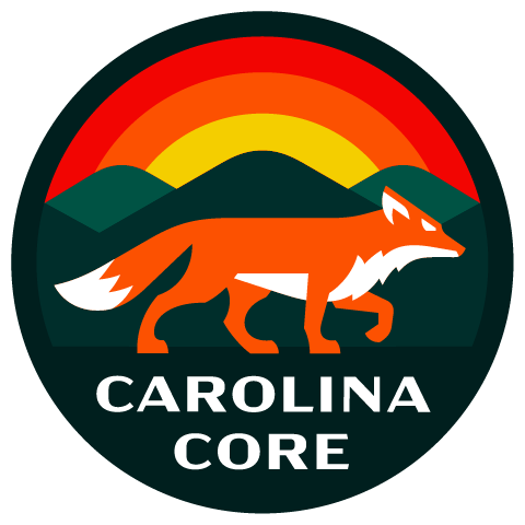
Carolina Core
MLS Next Pro is made up almost entirely of reserve squads, trotting out the same looks as their parent clubs, but there are two independent teams and the Core used their home kit to make sure everyone knew they were their own -- and they are fly.
Carolina says the kit is inspired by the area's textile industry, and that's wonderful, but more than anything the thing is simply beautiful. The pattern and pops of color at the bottom are sensational, but they fade out toward the top, which keeps the kit from being overwhelming. The way the gold comes in not only on the trim, but also with the numbers on the shorts and, most importantly, in the simple fox for the crest, is why this is one of the best kits American soccer has to offer.
It's spot on in its big, bold ideas, and also hits the mark in small details.

Las Vegas Lights
Sometimes it's not just about whether the kit looks good or not, it's also about who wears the kit. This is one of those scenarios because the Lights' home kit would look goofy for almost any other club, but feels right at home in Las Vegas.
The Lights call this their "Downtown Gold" kit and it's not hard to see why, with the shiny sponsor and trim. The two tones of blue and the collar, along with the gold, is a lot for a kit that is based in pretty routine colors. Combine these elements and you have a shirt that looks right at home in Old Vegas and that's what makes this kit sing -- it's screaming Elvis impersonator, bright lights and maybe a little crime. It's Vegas, baby.

Miami FC
Miami is one of the few cities that could rival Las Vegas for permission to be over-the-top, but Miami FC didn't go for that. Instead, they came up with a simple away kit that mirrors the city's flag, with the crest right there in the center.
Not only does the kit nail the Miami flag, but the orange trim is a really nice touch, and there's embossing on the shoulders and back that reads "1896" for the year the city was founded. In each detail, big and small, this kit is rooted in the city's home, giving it a clear sense of place while being the rare "clean" white shirt that is well designed and has something to say.
Is it the most inventive kit? Not really, but while everyone around the world is reaching for pink-and-black kits with Lionel Messi's name on the back, the best jersey in Miami is this white beauty that is really repping the city right.

Oakland Roots
Oakland knocked it out of the park with its crest and its kits have been eating off that plate ever since. After all, when you've got the multicolored tree roots that resemble stained glass, you always have tons of imagery to play with, so it's no surprise that Oakland has had tremendous threads since it began in 2019 and this year is no exception.
The colorful pattern pulled from the crest dominates the kit and draws your eye, making for a unique and distinctly Roots kit, but the black block stripes still ground this as a black kit, which, again, comes back to their identity. It's beautiful and a great bit of work from Charly, which has made several of USL's best looks.
And while this is about Oakland's home kit, a quick tip of the cap to the away kit that used the A's green and gold as an homage to the MLB team that was snatched from the city.

Portland Hearts of Pine
Maine's newest club, which began play this year, came out firing with some of the best kits anywhere in the world. While the home shirt is a work of art, it's the away look that landed them here.
It's a gorgeous kit, with the hearts jumping off the white shirt and the trim giving it a composed look. Somehow, they made a jersey littered with hearts look restrained, and the simple "Maine." fits perfectly. It also allows the club's terrific badge to shine.
Making things all the better is that the hearts aren't just a design choice plucked to look good. Every Feb. 13 for more than 40 years, the Valentine Bandit has littered Portland buildings and parks with red hearts as a sign of warmth and love in the city's cold, white winters.
This kit is rooted in Portland lore -- gorgeous in concept and aesthetic.
Worst kits

Chattanooga FC
Unfortunately, the second independent club in MLS Next Pro didn't do such a great job. Chattanooga's away kit is muddled by the Adidas template, which you see all over MLS, but the design team doubles down with a graphic across the front that plays with lines and angles to create an illusion of bending.
The problem here is they are using a soft illusion with hard wavy lines from the template. It clashes, turning the whole kit into a mess.

El Paso Locomotive
El Paso's home and away kits are nice, but it has a third kit that is hideous. Locomotive call it their Graffiti kit, and it certainly delivers on its name, but not particularly artfully.
It's nice that the club wanted to tap into the local graffiti culture, and credit to them for taking a big swing, but this one is a big miss. Fortunately, as an alternate kit, it's not going to be worn much.

Indy Eleven
Indy has smartly leaned into the checkered-flag motif ever since its debut season, and on some occasions it really works. This year's away kit is not one of those occasions.
The swoop across the front that breaks the checkered pattern is both odd and throws other elements of the shirt out of whack. The Ford logo looks out of place with the way it overlays a small portion of the checkered background, but is plain red underneath, the Under Armour logo gets highlighted while the club crest blends in. This one really misses.

Sacramento Republic
Republic have had some terrific kits, so it's a bit disappointing to see them toss in a clunker like they did with this season's home kit. Hoops often look good, but the complicated nature of the hoops on Sacramento's shirt makes the whole thing look bizarre, with three different colors in the hoop, two of which repeat.
There's a lot for Republic to work with, from color, to the star, to the California grizzly bear, which is why they often do so well, but this looks like it was ripped from a bad 1970s couch.

Spokane Velocity
Give Spokane credit for sticking with its visual identity. The Velocity had stripes that stopped halfway down the kit in their inaugural 2024 season and have brought it back this year. The problem is that it's not a very good look.
They use the same design on both kits, but it looks better on the home blue than away white, where it genuinely looks like the printer ran out of ink. That the sponsor logo creeps below the stripe, so part of it is on the plain white, doesn't help Spokane at all.
Wildest
![]()
Carolina Ascent
The Ascent came out swinging in the first season of the USL Super League, rocking a technicolor kit that reflects the sunrise over the Carolina hills. From the navy at the bottom to the orange top, the shirt is giving you every bit of the light coming across the land in the early morning hours.
What makes it work is each color of the kit is in the team's crest. This is their visual identity and they are not scared of it in the slightest. This is truly a full send, and that's admirable.

Forward Madison
The club from the college town and capital of Wisconsin that wears pink and blue, with a flamingo mascot, is a bit wild, you say?
Forward Madison have been pushing the envelope since Day 1, and this season is no different with what they call the Icebreaker kit. It's predominantly pink, with plenty of blue, and it really does look like ice breaking. It's fitting for a town that freezes over all winter before thawing out just in time for some USL League One soccer, but that doesn't make it any less audacious.

New Mexico United
A lot of United's aesthetic comes from Meow Wolf, the interactive art installation company that shares an owner with the soccer club and adorns the front of the team's kit. Big colors and design are Meow Wolf's thing, and when you slap their trippy logo on the front of your shirt, then the design has to match.
The Roadrunners did that with the Glitch kit, putting specks of yellow all over the black shirt around the Meow Wolf logo. It's a lot, as the club's kits normally are, but you've got to give them credit for leaning in. All the way in.
![]()
New Orleans Jesters
If you're going to call yourself the Jesters, then you better not be scared of looking a little goofy. This club wasn't, going full bore into Mardi Gras colors with a purple kit that has green and yellow accents.
Importantly, the Jesters worked in the accent colors with a bit of a haphazardness. It looks like someone, potentially enjoying Mardi Gras a little too much, fell into a vat of Mardi Gras attire and came out looking like this. That's a compliment, by the way. It's exactly what an NPSL team named the New Orleans Jesters should look like.

Tampa Bay Rowdies
Few clubs anywhere in American soccer have as clear of an identity as the Rowdies, who trace their history back to the original NASL in 1975. With that pedigree, it's not exactly revelatory when they bust out a bright green and yellow kit -- after all, that's who they are and have always been.
Still, when you're willing to stripe your shoulders in that green and yellow, to go along with a shirt that's already predominantly green with a collar, you have got to give them credit for being so loud and daring. They are going to be who they are, ten toes down, loud and proud.